1
Terminix
Est. 1927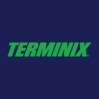
Color Palette
Prompt Used
“Create an original pest control logo for a fast-response exterminator, bold wordmark, red accent, clean professional service brand, no similarity to Terminix or any existing logo”
Terminix is a strong pest control logo reference because it leads with a confident name and a direct, high-contrast color system. The mark feels established, fast, and national without needing an illustrated bug. For local exterminators, the lesson is clarity: a strong wordmark and a decisive color can do more than a messy pest collage.
Design Elements
Bold wordmarkAction redNational service brandHigh contrast
Pros
- Bold wordmark feels authoritative and easy to remember
- Red creates urgency without relying on gross pest imagery
- Simple composition scales well across vans, uniforms, and ads
Cons
- Red-heavy branding can feel too aggressive for family-safe positioning
- A similar shield or wordmark treatment would look derivative in the same category