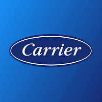
Hvac9 min read

15 Best Hvac Logos for Inspiration in 2026

In the competitive hvac industry, your logo serves as the cornerstone of your brand identity. Whether you're launching a new venture or refreshing an established business, your visual identity must communicate your values, quality, and unique positioning at a glance. The best hvac logos create instant recognition while conveying the specific benefits and experience your brand offers. From industry leaders to innovative newcomers, successful hvac logos share essential qualities: they're memorable, versatile, and strategically designed to resonate with target audiences. In this comprehensive guide, we analyze 15 outstanding hvac logos, breaking down the design principles and strategic thinking that make each one effective.

By LogoCrafter Team|Updated February 3, 2026
15 Best Hvac Logos for Inspiration in 2026

Key Design Elements in Hvac Logos

Designing an Hvac logo requires a deliberate approach to every element—color, typography, symbols, and shapes. Each piece must align with the industry’s values of reliability and technical expertise while standing out in a crowded market. Here’s what to focus on.

Colors

Color sets the emotional tone of your brand. In Hvac, blues are dominant because they evoke coolness, trust, and professionalism—think of icy air or calm reliability during a crisis. Reds and oranges often signal heating services, suggesting warmth and energy. Many brands combine these tones to represent both sides of their offerings. Neutrals like grays or blacks can anchor the design, adding a sense of durability and strength. Avoid overly bright or neon shades; they can feel cheap or untrustworthy in this context.

Typography

Fonts in Hvac logos need to scream stability. Sans-serif typefaces are a go-to because they’re clean, modern, and readable at small sizes—think of a logo on a service sticker. Fonts like Helvetica or Arial derivatives work well for their no-nonsense clarity. If you’re using a serif font, keep it subtle and classic to maintain authority without looking outdated. Avoid script or decorative fonts; they’re too whimsical for an industry rooted in technical precision.

Symbols

Icons and symbols can make your logo instantly recognizable, but they must be relevant. Common motifs include flames for heating, snowflakes or waves for cooling, and vents or fans for air circulation. These elements should be stylized, not literal—think abstract curves or geometric shapes over cartoonish drawings. A well-designed symbol can double as a standalone mark for social media or app icons, amplifying brand recall.

Shapes

Shapes in Hvac logos often lean toward strength and balance. Circular or shield-like forms suggest protection and dependability, reinforcing the idea that your brand safeguards comfort. Angular shapes or chevrons can imply forward motion and innovation, appealing to clients seeking cutting-edge solutions. Avoid overly complex geometry; it muddies the message and fails at smaller scales. The goal is a shape that feels deliberate and ties back to your brand’s core promise—whether that’s comfort, efficiency, or reliability.

Every design choice must work in harmony. A mismatched color or an illegible font can tank your logo’s impact. Study competitors, but carve your own path with elements that reflect your unique value in the Hvac space.

Hvac Logo Examples Analyzed

Let’s dive into some standout Hvac logos from industry leaders to see what works and why. These brands have mastered the art of visual identity, balancing industry relevance with unique flair. I’ve picked five examples to break down, focusing on their design choices and how they connect to their brand values.

Carrier () is a textbook case of timeless simplicity. Their logo uses a clean, sans-serif typeface with a subtle curve in the ‘C’ that hints at airflow or circulation. The deep blue color screams trust and cooling, aligning perfectly with their reputation as pioneers in air conditioning. There’s no unnecessary iconography—just a wordmark that’s confident and versatile across applications.

Trane () takes a bolder approach with its angular, futuristic wordmark. The sharp lines in the ‘T’ and ‘R’ suggest precision and cutting-edge technology, while the red accent color adds warmth, nodding to their heating solutions. It’s a logo that feels dynamic yet authoritative, perfectly capturing their innovative edge in the Hvac space.

Lennox () leans into a minimalist wordmark with a slight twist—the ‘O’ is often styled as a subtle orbit or loop, evoking energy efficiency and circulation. Their use of green tones in branding ties to sustainability, a growing concern in Hvac. It’s a smart, understated way to signal eco-friendliness without overcomplicating the design.

Rheem () combines a strong wordmark with a red and blue color scheme, directly referencing heating and cooling. The simplicity of the sans-serif font ensures readability, while the dual colors create visual balance. It’s a no-frills design that communicates exactly what they do—reliable temperature solutions.

Daikin () stands out with its abstract symbol—a stylized ‘D’ that doubles as a nod to airflow or motion. Paired with a clean typeface and a blue palette, it feels modern and global, reflecting their international presence. The logo’s versatility shines in digital and print, proving that a well-designed mark can adapt anywhere.

These logos succeed because they prioritize clarity and relevance. They don’t try to be everything to everyone—they focus on what their brand stands for, whether it’s innovation, trust, or sustainability. Study these examples to see how subtle design choices can make a massive impact in the Hvac industry.

Color Psychology in Hvac Branding

Color isn’t just a design choice in Hvac logos—it’s a psychological trigger that shapes how clients perceive your brand. In an industry where trust and comfort are paramount, the right colors can make or break your visual identity. Let’s unpack why certain hues dominate Hvac branding and how they influence customer emotions.

Blue is the heavyweight in Hvac design, and for good reason. It’s universally tied to coolness—think icy air or refreshing breezes—which directly connects to air conditioning. Beyond that, blue conveys trust, reliability, and calmness. When a customer’s AC breaks down, they want a brand that feels like a safe bet. A deep or medium blue in your logo signals that you’ve got their back. Lighter blues can suggest innovation or eco-friendliness, appealing to modern, sustainability-focused clients.

Red and orange play a crucial role for brands emphasizing heating services. These warm tones evoke energy, heat, and urgency—perfect for reminding clients of your furnace repair expertise. But use them sparingly; too much red can feel aggressive or alarming. Many Hvac logos pair red with blue to balance the hot-cold dynamic, visually representing their full range of services.

Green is gaining traction in Hvac branding as energy efficiency becomes a selling point. It suggests environmental responsibility and freshness, appealing to clients who prioritize sustainable solutions. A muted green can add a layer of approachability to your logo without detracting from professionalism.

Neutrals like gray, black, or white often act as grounding elements. Gray suggests durability and industrial strength, while black adds a sleek, authoritative edge. White, often used in negative space, keeps things clean and uncluttered. These tones are rarely the star of the show but provide balance to bolder colors.

Choosing the right color palette isn’t about trends—it’s about aligning with your brand’s promise. If you’re a premium service provider, stick to sophisticated blues and grays. If you’re targeting budget-conscious clients, a friendly green or warm orange might resonate more. Test your colors in real-world applications to ensure they evoke the right emotions across your audience.

Typography Choices for Hvac Logos

Typography in Hvac logos isn’t just about picking a font—it’s about projecting the right personality for your brand. In an industry built on trust and technical know-how, your typeface needs to feel solid, readable, and professional. Here’s what works and why.

Sans-serif fonts are the backbone of most Hvac logos. They’re clean, modern, and incredibly versatile, ensuring your logo looks sharp whether it’s on a website or a muddy work truck. Fonts like Futura, Gotham, or even custom sans-serif designs strip away unnecessary ornamentation, focusing on clarity. This matters when your logo is scaled down to a business card or equipment label—legibility is king.

If you’re aiming for a more traditional or authoritative vibe, a subtle serif font can work, but it needs to be restrained. Think of something like a modernized Times New Roman or a custom serif with minimal flourishes. Serifs can suggest heritage and dependability, which resonates with clients looking for a long-standing, reliable company. But avoid overly ornate options—they can look dated or fussy in a field that values precision.

Bold weights are often favored in Hvac typography to convey strength and confidence. A thick, heavy font says, ‘We’re here to solve your problem, no questions asked.’ Just don’t go overboard—too much boldness can make the design feel clunky. Pairing a bold wordmark with a lighter tagline can create a nice hierarchy and balance.

Spacing and kerning are just as critical as the font itself. Tight, even spacing ensures your logo feels polished and intentional. Sloppy typography can subconsciously signal a lack of attention to detail—fatal in an industry where precision is everything.

Ultimately, your typeface should match your brand’s voice. If you’re a cutting-edge Hvac startup, a sleek sans-serif screams innovation. If you’re a family-owned business with decades of history, a classic serif might feel more authentic. Test your typography across mediums to ensure it holds up, and don’t be afraid to tweak until it feels just right.

Key Takeaways

The most successful hvac logos share fundamental design principles: they communicate brand values instantly, remain versatile across all applications, and create emotional connections with their target audience. Whether through distinctive typography, meaningful symbols, or strategic color choices, effective hvac branding tells a story before a single word is read. As you develop your own hvac logo, focus on clarity, memorability, and authentic representation of your brand's unique value proposition. Consider how your logo will appear across all touchpoints—from business cards to billboards, websites to wearables. Ready to create a logo that elevates your hvac brand? Let LogoCrafter AI help you design a distinctive, professional logo that captures your vision and resonates with your audience.

Frequently Asked Questions

What makes a great hvac logo?

An effective hvac logo should clearly communicate your brand's unique value proposition while appealing to your target audience. It needs to be simple enough for instant recognition, versatile enough for all applications (from social media avatars to signage), and distinctive enough to stand out from competitors. The best hvac logos also evoke the right emotional response—whether that's trust, excitement, sophistication, or warmth—depending on your brand positioning.

What colors work best for hvac logos?

Color choice for hvac logos should align with your brand personality and audience expectations. Industry norms can guide but shouldn't limit you—sometimes standing out means choosing unexpected colors. Consider color psychology: blues convey trust and professionalism, greens suggest growth and nature, reds create urgency and passion, while black communicates sophistication. Most importantly, ensure your colors work well together, remain legible at all sizes, and reproduce accurately across digital and print media.

Should my hvac logo include an icon or symbol?

Whether to include an icon depends on your brand strategy. Icons can increase memorability and work well as standalone marks (think app icons or social media avatars). However, wordmarks can be equally powerful when typography is distinctive enough. Many successful hvac brands use combination marks—pairing an icon with text—giving flexibility to use either element independently. Consider your primary use cases and how recognizable your brand name is when deciding.

How can my hvac logo stand out from competitors?

Differentiation starts with research—study competitor logos to identify common patterns, then strategically deviate. This might mean choosing an unexpected color palette, using a distinctive typographic style, or incorporating a unique symbol. However, standing out shouldn't mean being confusing; your logo should still clearly communicate what you do. The goal is memorable distinctiveness that reinforces your unique market position.

What typography works best for hvac brands?

Typography should match your brand personality. Serif fonts convey tradition and reliability, making them popular for established hvac businesses. Sans-serif fonts feel modern and clean, ideal for contemporary brands. Script fonts add elegance or playfulness depending on style. Custom or modified typefaces create unique identity but require more investment. Whatever you choose, prioritize legibility—especially at small sizes—and ensure the font family offers enough weights for various applications.

How important is a professional logo for hvac businesses?

Extremely important. Your logo is often the first touchpoint with potential customers, and studies show people form opinions about brands within milliseconds. A professional hvac logo builds credibility, creates trust, and justifies premium pricing. It's not just a design expense—it's a business investment that affects perception across every customer interaction. Amateur logos can undermine even excellent products or services by suggesting lack of professionalism or attention to detail.

You Might Also Like

Create Your Professional Logo

Skip the hassle and create a professional logo in seconds with LogoCrafter AI. No design skills needed.

Download LogoCrafter