What Makes a Great Coffee Logo?
When designing a logo for a coffee shop, you’re not just creating a visual mark—you’re crafting an identity that resonates with a specific audience. Coffee culture is deeply personal, tied to rituals, comfort, and community. A great coffee logo captures this essence while standing out in a crowded market. It’s about balancing creativity with functionality, ensuring the logo works across cups, signage, and digital platforms.
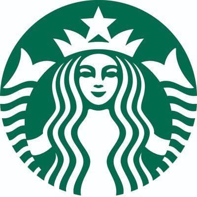
First, a coffee logo needs to evoke warmth and familiarity. Coffee is often associated with comfort, mornings, and connection. Your design should reflect these emotions through inviting shapes, soft edges, or nostalgic imagery. Think of the classic coffee cup or bean motifs—they’re overused for a reason. They instantly signal ‘coffee’ to the viewer. But the best logos take these familiar elements and add a unique twist, whether through a clever illustration or an unexpected color palette.
Second, versatility is critical. Coffee shops often have diverse touchpoints—think menus, packaging, social media, and storefronts. Your logo must scale well, looking just as sharp on a tiny espresso cup as it does on a large banner. This means simplicity is key. Overly detailed designs lose impact when shrunk down. A strong coffee logo often relies on clean lines and minimal elements to maintain clarity at any size.
Third, it should reflect the brand’s personality. Is your coffee shop a trendy urban spot, a cozy local hangout, or a high-end artisan roastery? The logo must align with this identity. A sleek, modern design with minimalist typography might suit a specialty roaster, while a hand-drawn, rustic logo could fit a neighborhood cafe. Understanding your target audience—whether they’re hip millennials or traditional coffee drinkers—guides these choices.
Finally, memorability sets the best coffee logos apart. With so many cafes on every corner, your logo needs to stick in customers’ minds. This often comes down to a distinctive element—a unique symbol, an unexpected color, or a clever play on words. When done right, it creates an instant connection, making your brand the go-to choice for that morning brew.


